
 Vida


PRODUCT DESIGN · CREATOR SUBSCRIPTION PLATFORM
A Subscription Platform Where Creators Keep 100% of What They Earn
A premium subscription channel for creators to publish exclusive content and earn directly from their audience, with zero platform commission and a payment experience built on clarity and trust.

Learn More

CREATOR-FIRST
/
ZERO-COMMISSION
/
TRANSPARENT
/
PREMIUM

ROLE
UX Design · Contributor
UI Design · Lead

PLATFORM
Mobile Web · Desktop Web

TYPE
Subscription Platform

UI PROCESS · 01 — VISUAL SYSTEM
The Foundations
The brand system I maintained across Vida’s website and app — colour, type, and iconography built for a premium, trustworthy feel.

Vida · A Creator Subscription Platform
Xiaochen Zhan · Product Design
Logo
Designed a custom lettermark by reworking the brand name “VIDA” itself into a compact graphic mark, paired with the full wordmark to form a unified, instantly recognizable lockup.

B
Brand Colour
Paired a composed Primary Indigo with an energetic Secondary Mint, echoing Vida's young, diverse creator base, from lifestyle to arts and wellness. A grey/light-surface system keeps text and UI states consistent and readable.
C
Typography
A bilingual type system — Helvetica Neue for Latin characters and numerals, PingFang SC for Chinese — sharing one consistent size and weight scale, plus a 10 / 20 / 30px spacing scale for layout rhythm.
D
Icon Language
Icons are built on a 20×20 base grid, scaling to 15×15 for small interactive toggles or 24×24 for larger contexts like attachments — rendered as simple solid glyphs rather than stroked outlines. The library is organised into functional and interactive categories, with a few interactive icons (like/liked, password visibility) carrying documented multi-state variants. Shown here: four icons from creators' most frequent actions.
#6567E8
Primary Indigo
#7FE2DD
Secondary Mint
#B2B2B2
Border / Divider
#575757
Ink / Text
#F7F7F7
Neutral Surface

Aa
Helvetica Neue
字
PingFang SC
STYLE
SIZE · WEIGHT
Page title · 页面标题
25 / Bold
Section title · 模块标题
18 / Bold
Body · 正文
14 / Regular + Bold
Caption · 辅助说明
12 / Regular + Bold
Button · 按钮
14 / Bold + Regular

Compose Post

Direct Message

Unlock Content

Explore
UI PROCESS · 02 — KEY SCREENS & DESIGN DECISIONS
From Framework to Interface
The UI decisions I made translating the product’s information architecture into a clear, trustworthy interface.

Vida · A Creator Subscription Platform
Xiaochen Zhan · Product Design

A
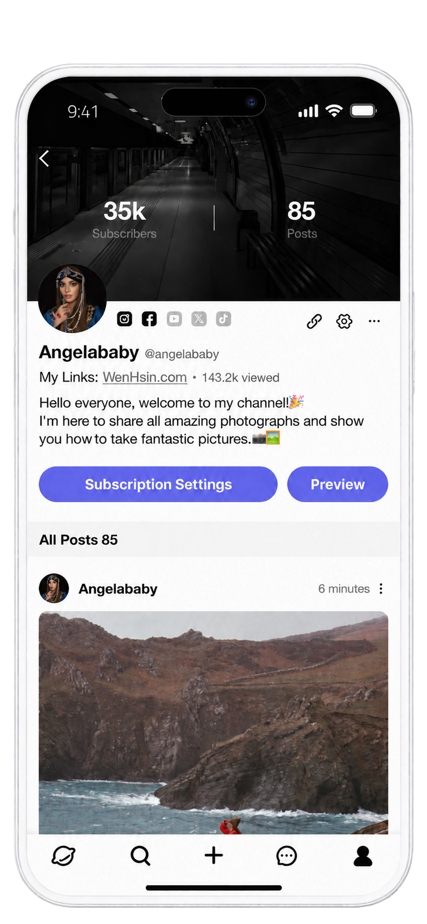
Creator Home
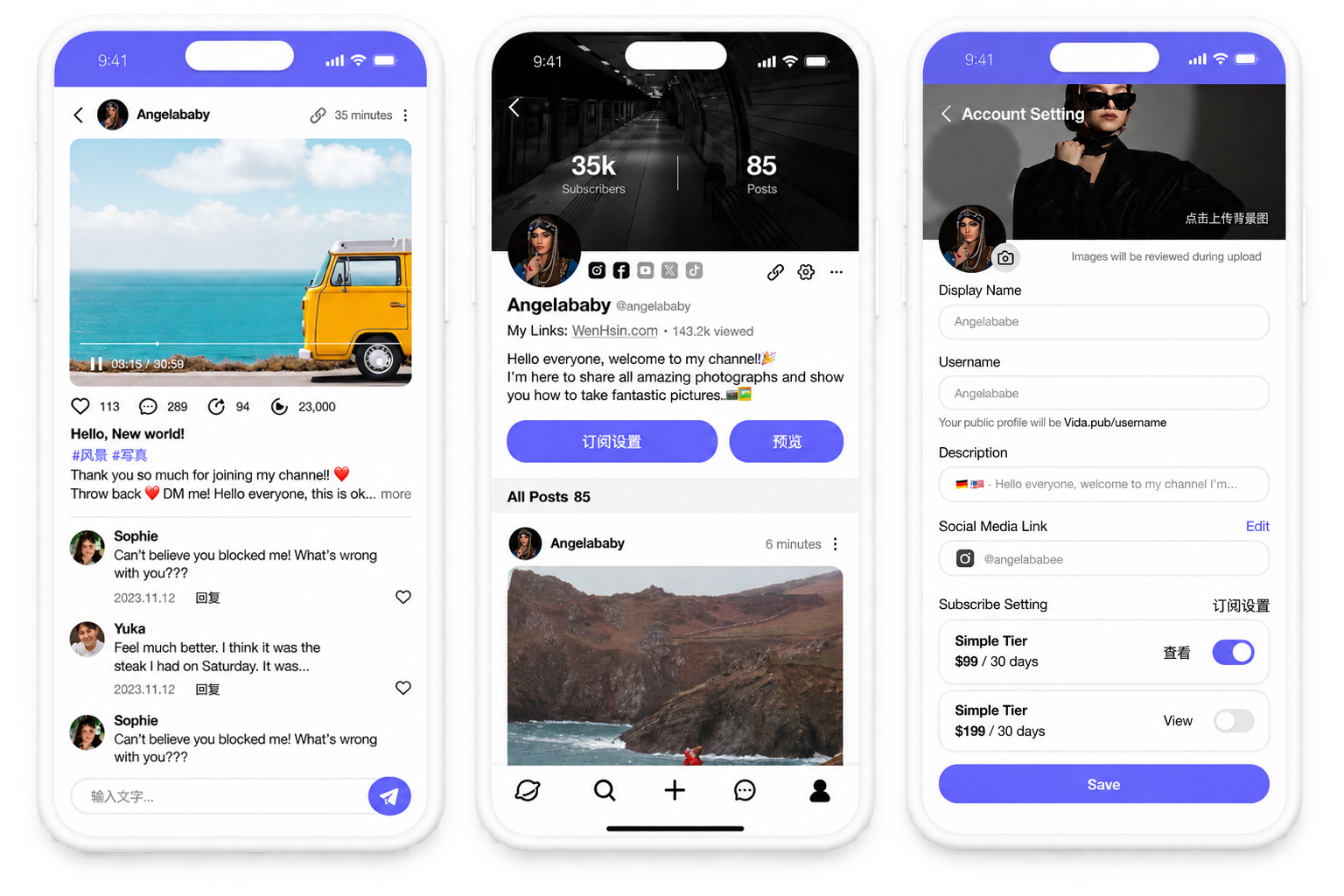
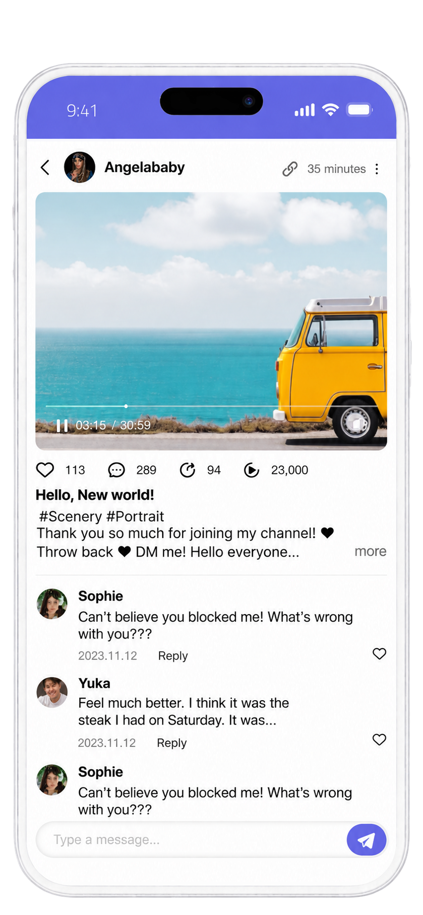
Creator Home overlays quantified reach — subscriber and post counts — directly on the hero banner, ahead of the creator's name or bio, while a compact subscribe action stays persistently visible in both the profile header and a pinned sidebar module.
B
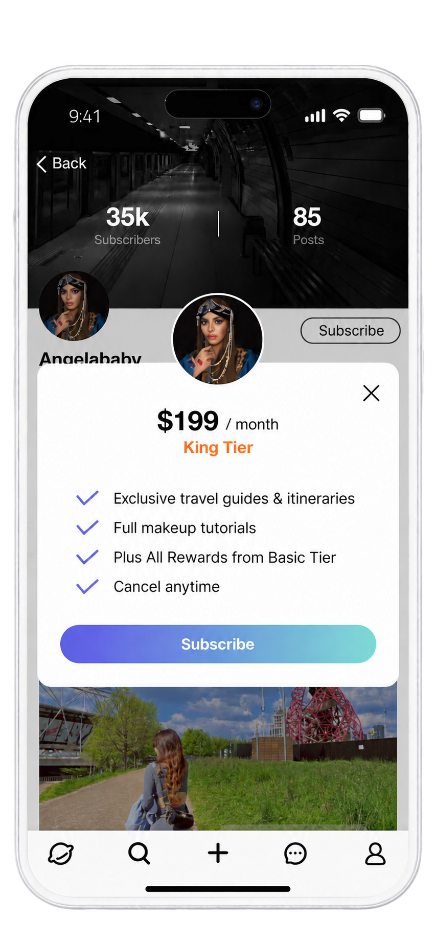
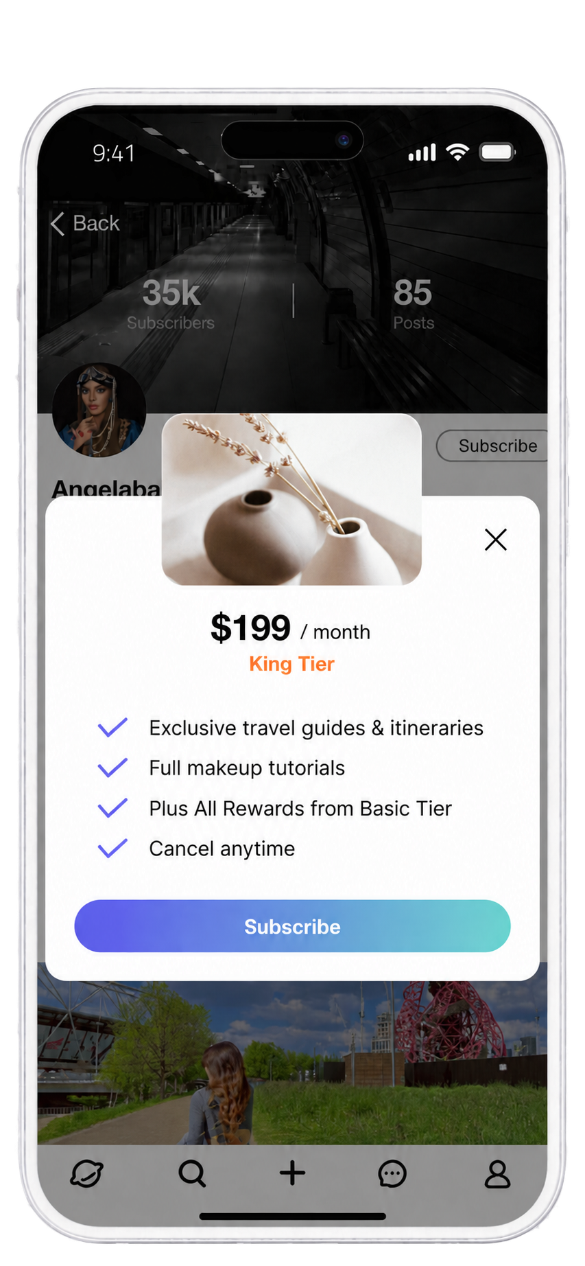
Subscription Modal
The subscription modal keeps price and tier name as the single dominant element, followed by a flat benefits checklist and one full-width commit action — expanding on the tier card already shown on the page rather than opening a separate purchase flow.



UI PROCESS · 02 — KEY SCREENS & DESIGN DECISIONS
From Framework to Interface
The UI decisions I made translating the product’s information architecture into a clear, trustworthy interface.

Vida · A Creator Subscription Platform
Xiaochen Zhan · Product Design

C
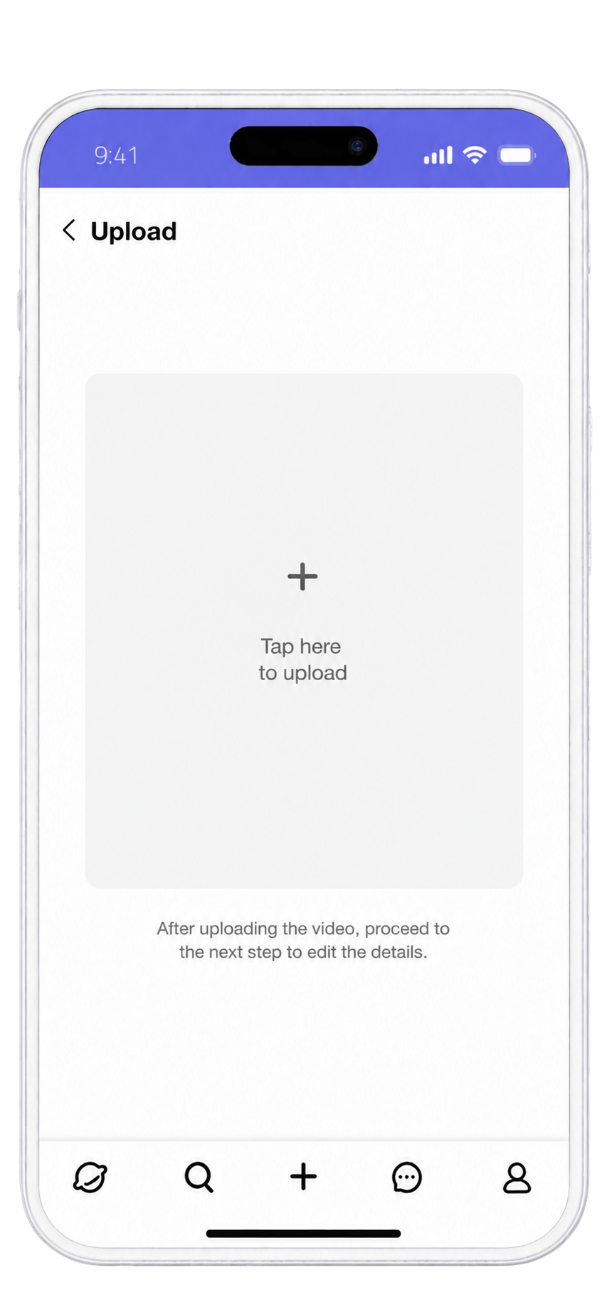
Publishing Flow
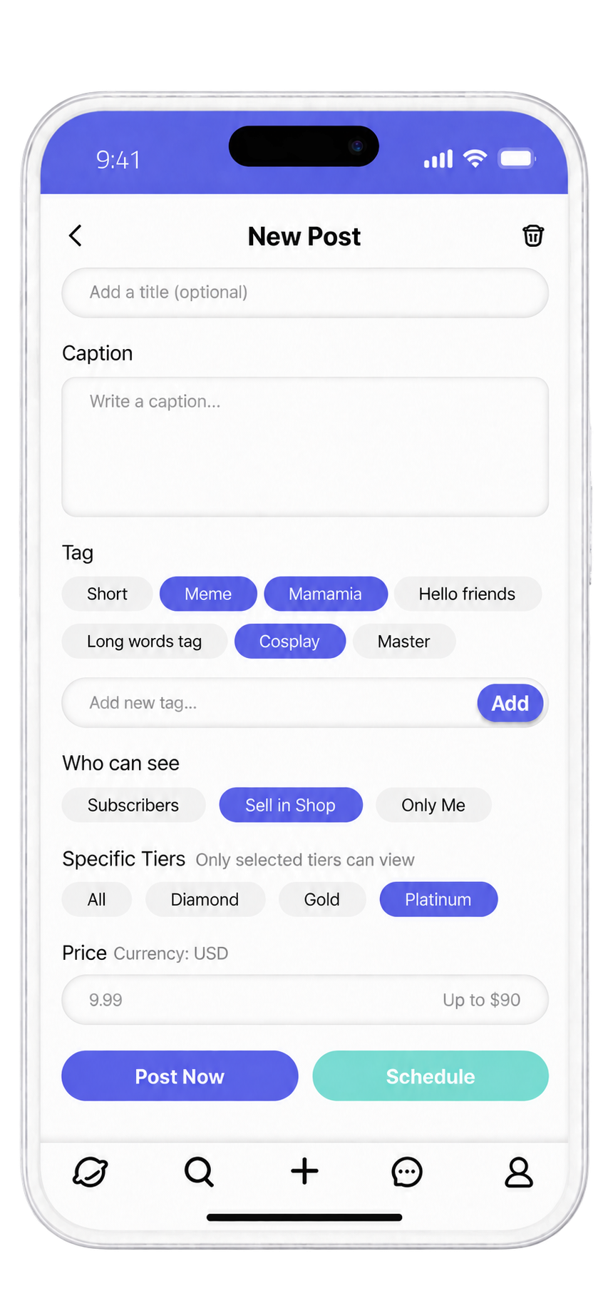
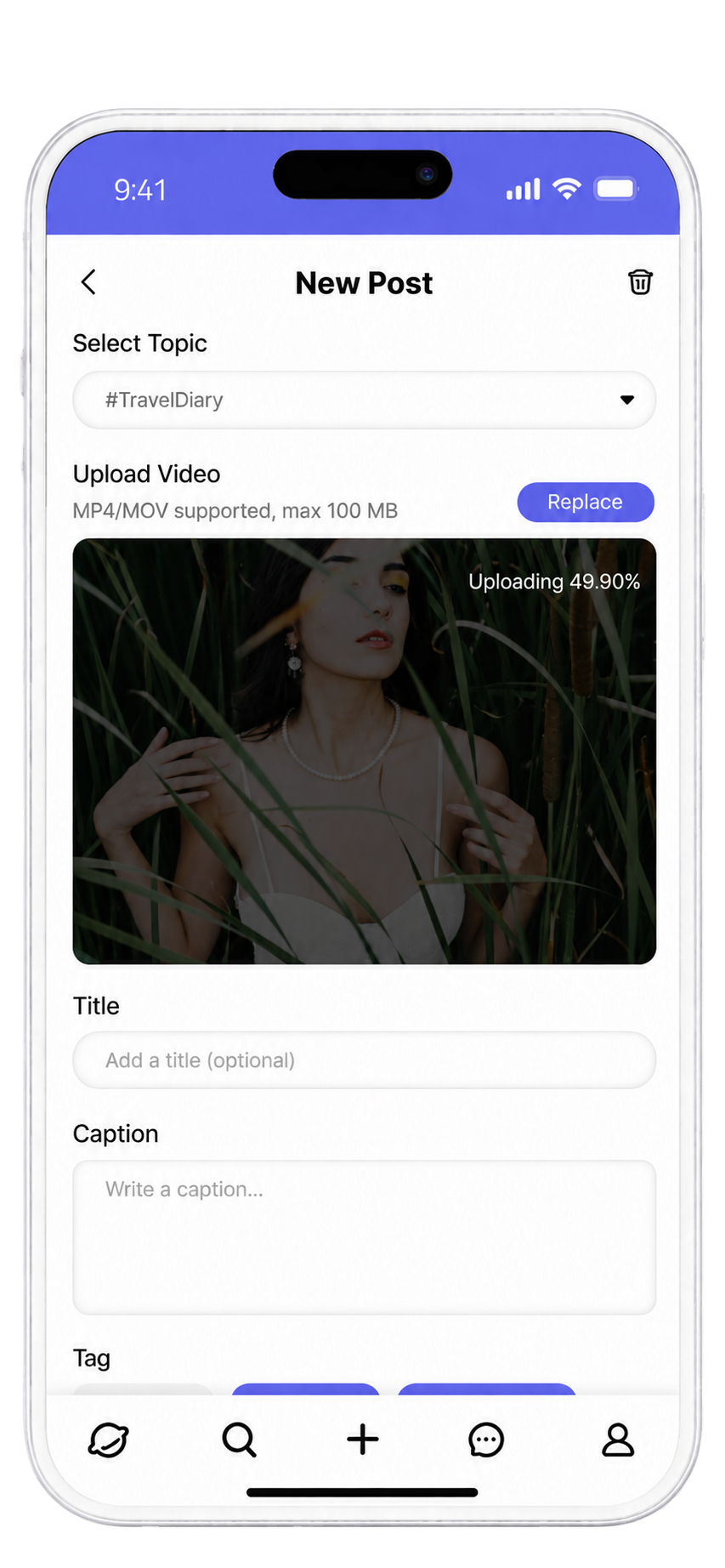
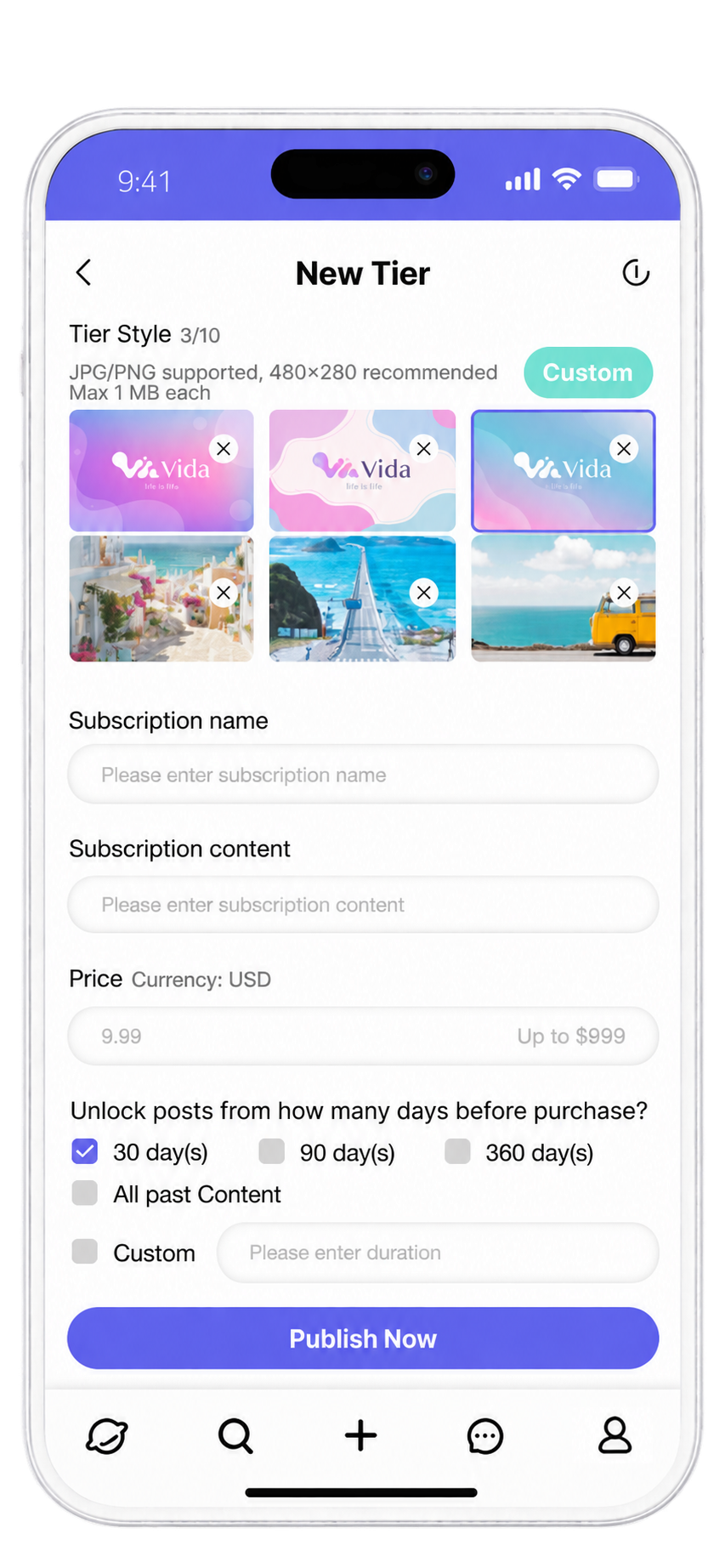
Publishing is broken into three focused overlays — upload, then metadata and tier-gating, then confirm — with live upload progress, an explicit post-review notice at success, and scheduling isolated to its own optional popup.
D
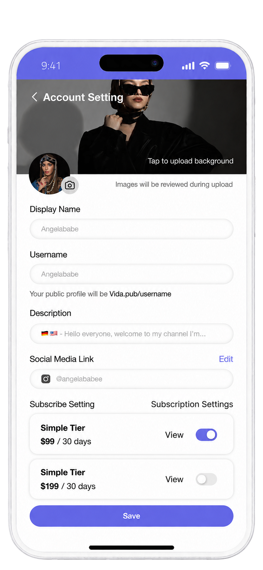
Account Clarity
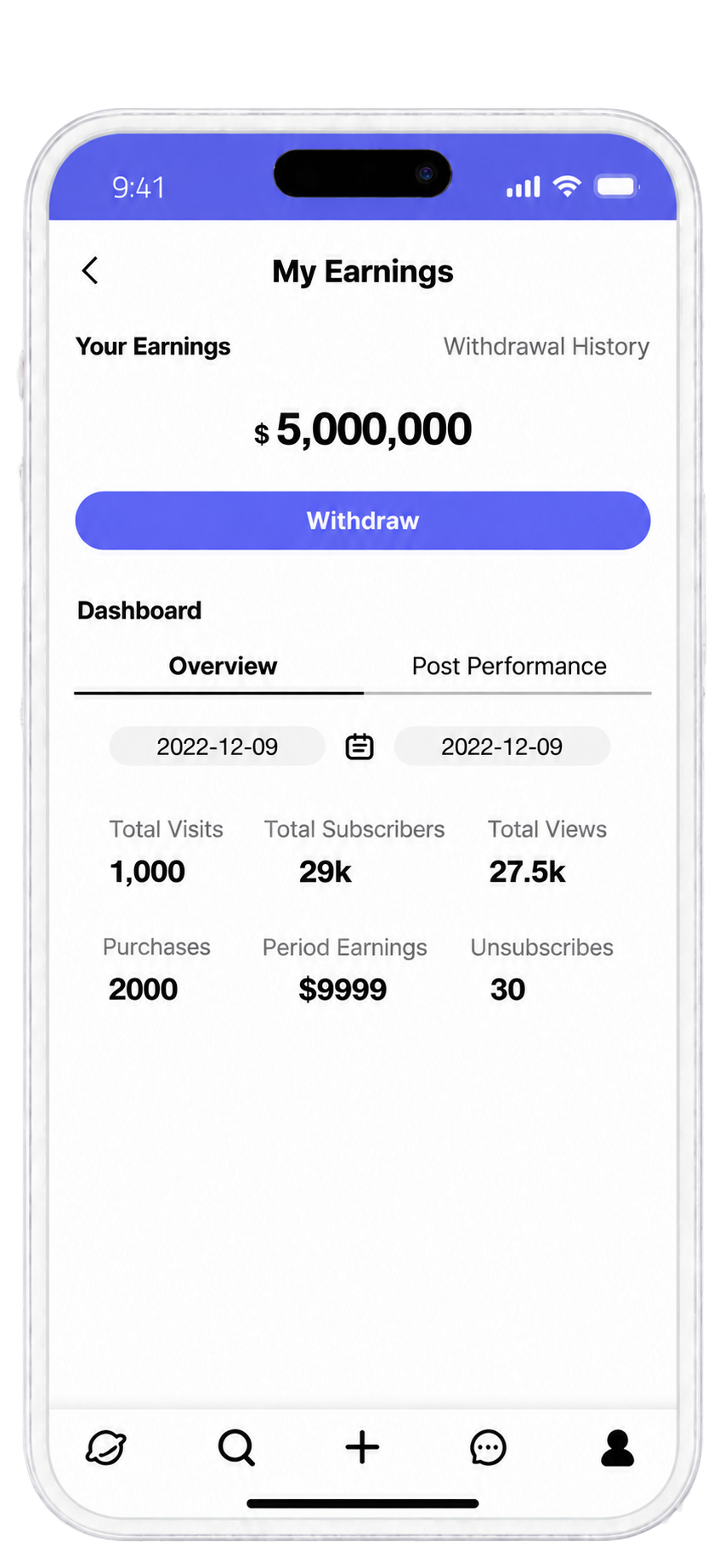
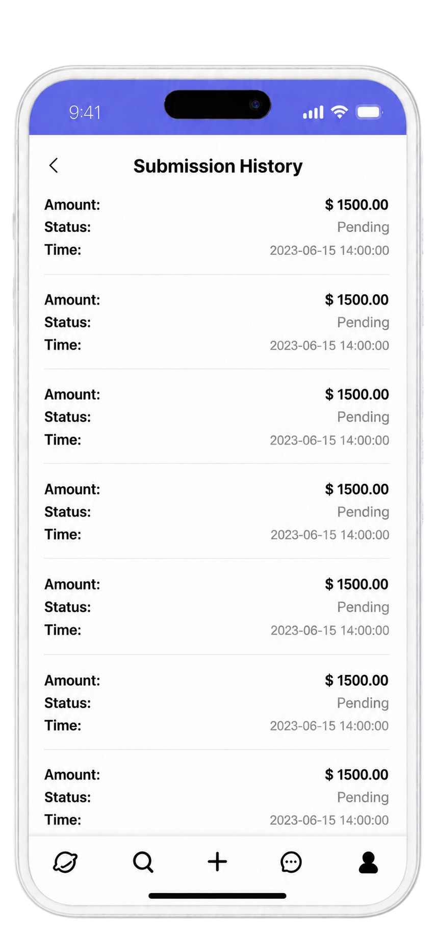
Account screens split cleanly by role: purchase history reads as a flat transactional ledger, while the creator's earnings screen leads with total balance and a direct withdrawal action, backed by both aggregate and per-post performance breakdowns.



UI PROCESS · 02 — KEY SCREENS & DESIGN DECISIONS
From Framework to Interface
The UI decisions I made translating the product’s information architecture into a clear, trustworthy interface.

Vida · A Creator Subscription Platform
Xiaochen Zhan · Product Design

E
Onboarding & Discovery
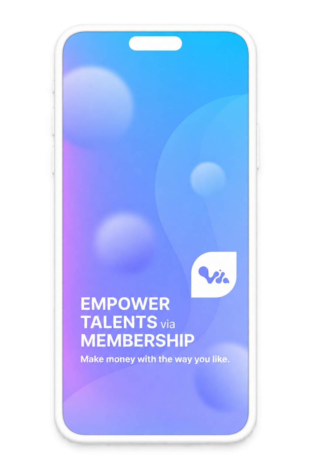
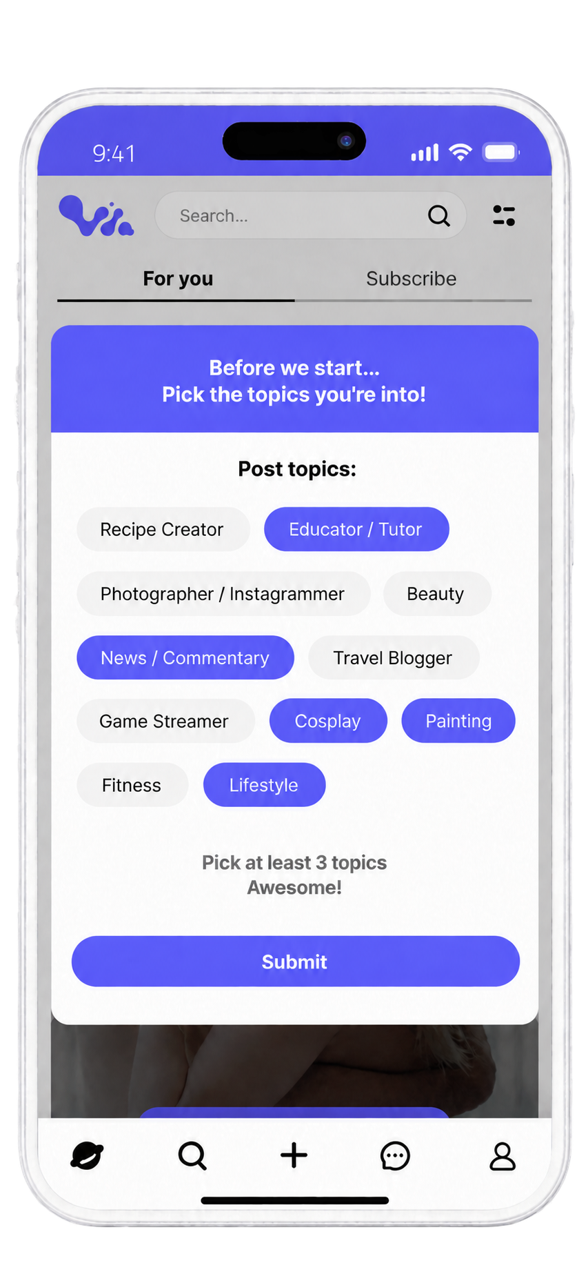
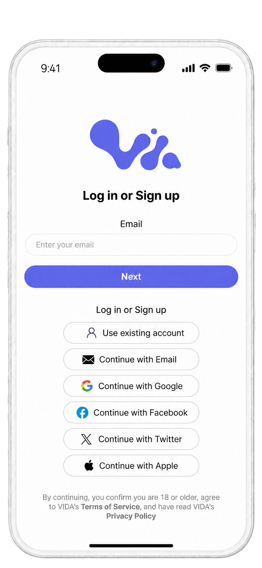
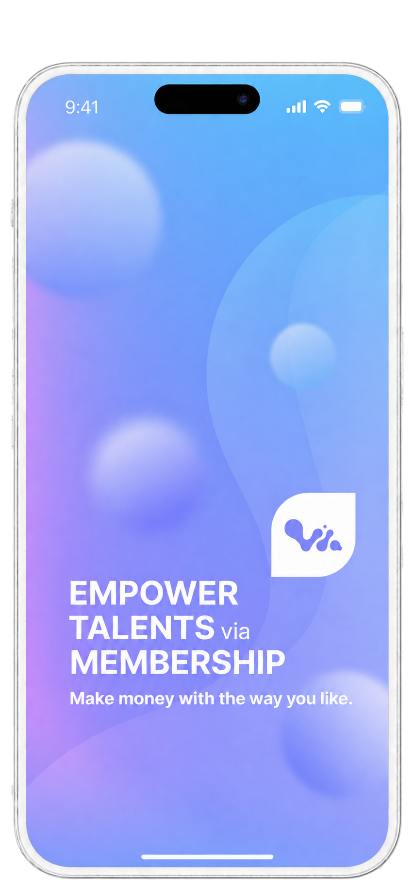
Splash, login, and browse all earn trust before friction: splash sets tone with a gradient mark and tagline, login folds age and terms into copy under Continue, and browse blurs only locked media — keeping likes and captions visible.
F
Messaging
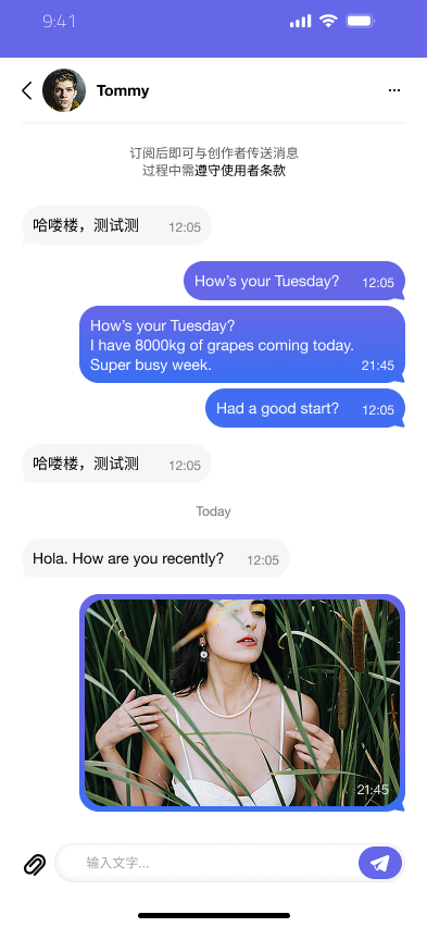
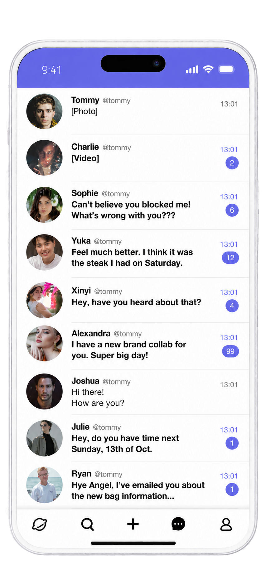
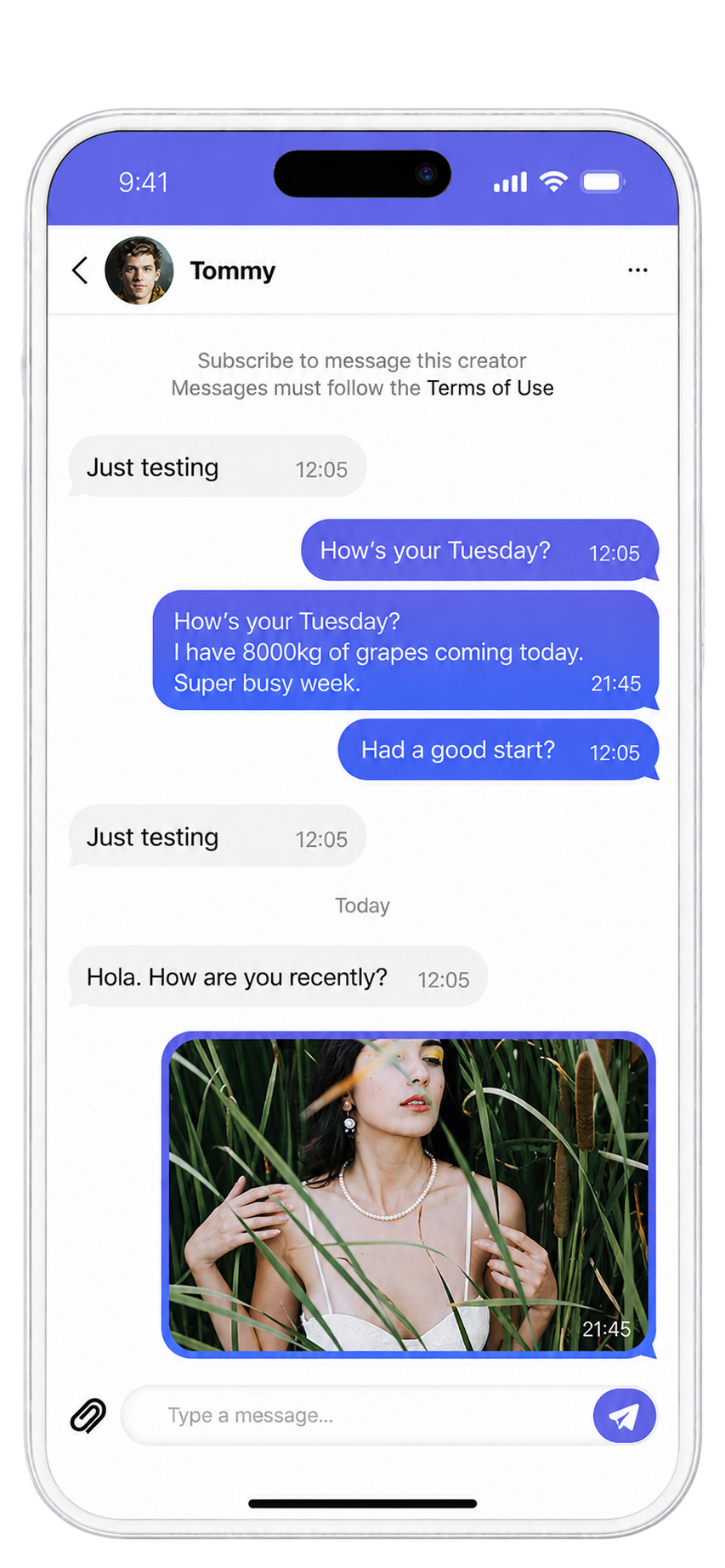
Messaging enforces subscribe-then-contact: an inline notice, not a popup, tells users they must subscribe before messaging a creator. Bubbles split by sender — purple outgoing, grey incoming — with unread counts shown directly in the list.



UI PROCESS · 03 — COMPONENT SYSTEM
One System, Many Contexts
How a small set of real components covers dozens of screens without multiplying variants.

Vida · A Creator Subscription Platform
Xiaochen Zhan · Product Design
Primary Button
One button component, resized per context — modal, full-bleed, or a single CTA — rather than a family of button styles.
Modal · 306px
View Subscription Plans
Full-bleed · 300px
Unlock CTA · 285px
Subscribe

Bottom Navigation
Selected state swaps the glyph itself — outline to filled — instead of only recoloring it.
Explore
Search
Create
Message
Mine
Same five icons appear across Explore, Search, Create, Message, and Mine — only the active tab renders filled.
Player Controls & Content Badges
Player icons and content-count badges render pure white — designed to sit on the blurred, dark media scrim, not on a light UI surface.
Message List — Read / Unread
The only visual difference between a read and unread row is the presence of a numeral badge — no bold weight, no highlight fill.
Input / Search Field
One field style, reused at whatever width its context needs — search bar, form field, or message composer.
Search...
Enter details...
Type a message...




03:15
/
30:59


33


Post Now
Schedule Post

Tommy
@tommy
[Photo]
13:01

Charlie
@tommy
[Video]
13:01
2
More From the Icon Set
A sample of the broader icon library — one style, one stroke weight, reused across settings, scheduling, sharing, and destructive actions alike.
Picture
Data
Setting
Search
Delete
Location
Link
Block
Share
Send

Delete
Information



UX PROCESS · 01 — BACKGROUND & MY ROLE
The Product, the People, and My Role
Before the problem, the context: what Vida is, who it serves, and where I sat in getting it right.
Vida · A Creator Subscription Platform
Xiaochen Zhan · Product Design
PROJECT BACKGROUND
What Vida Is
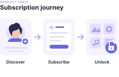
A creator-first subscription platform where fans pay to unlock exclusive content directly from creators, across mobile and desktop web.
Who Uses It
Two sides of one loop: creators who publish and price their content, and subscribers who discover creators and pay to access it.
Why It Mattered
The subscribe-and-unlock flow is the product’s core transaction — any confusion there costs trust and revenue directly.
MY ROLE
What I Owned
UX contributor and UI lead across the product’s web experience — from information architecture through to shipped screens.
Who I Worked With
Collaborated cross-functionally with product and engineering — some fixes needed product sign-off, others I initiated and drove myself.
Constraints
Mobile web and desktop web only, working within an existing subscription and payments system I didn’t own end-to-end.




Creators
Exclusive content
Subscribers














Product

Design


Engineering
9:41


35K
Subscribers
85
Posts


Creator Name
@creator
Subscribe
Preview
All Posts · 85


Creator Name
6 minutes ago





subscription.service.ts
▾ src
subscription.service.ts
unlock.controller.ts
payment.webhook.ts
types.ts
▾ tests
subscription.test.ts
1
2
3
4
5
6
7
8
9
10
11
12
13
14
TERMINAL
$ npm run build

Build succeeded · all checks passed


UX PROCESS · 02 — PROBLEM & EVIDENCE
Support Tickets Pointed to the Unlock Logic
Before any redesign, I traced the confusion back to its source — real support signals and the actual subscription flow, not assumptions.
Vida · A Creator Subscription Platform
Xiaochen Zhan · Product Design
THE INVESTIGATION


How I Found It
Customer-service tickets kept surfacing the same complaint, and a live in-app feedback channel let users report the same issue directly.
Customer-service tickets + live in-app feedback

What the Evidence Showed
Subscriptions only unlocked a rolling window of a creator's posts. Users assumed subscribing meant full access, so when part of the content stayed invisible after subscribing, it read as broken, not intentional.
The mismatch: full-access expectation vs rolling-window access
The Unlock Window, Visualized
A subscription unlocks a rolling window, not the full archive.
OLDER POSTS
LATEST POSTS
N days ago

Still locked — outside the window
Unlocked — within the window
KEY INSIGHT
Subscribed users expected full access to a creator’s history — not a partial, silently-shrinking view of it.

UX PROCESS · 03 — KEY DESIGN DECISIONS
Full Access, Not a Rolling Window
What I considered, what I chose, and what it cost to get there.
CONSIDERED
Clarify the Window
Keep the day-window limit, but make it visible — label which of a creator’s posts fall inside the unlocked range and which don’t.
Not pursued — treats the symptom, not the cause
CHOSEN
Remove the Window
Drop the day-window limit entirely — subscribing unlocks all of that creator’s content, immediately.
Chosen — matches what users already expected
→
The Trade-off
This wasn’t a design-only call — removing the window changes the subscription’s underlying scope, so it needed product sign-off rather than shipping directly from a UI fix. A natural next step: give creators clearer ways to tier value — by content type or per-post unlocks — instead of a hidden time window.


Labeled, but 3 of 5 posts still inaccessible
All 5 posts accessible, no distinction needed


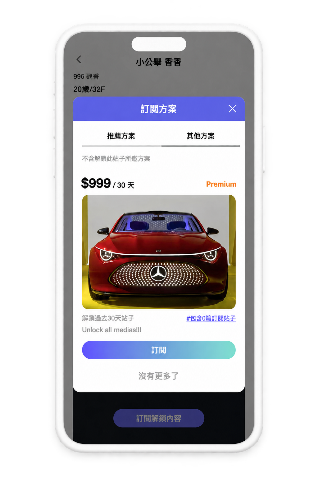
BEFORE
Creator page, day-window active
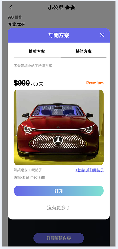
A subscribed user opens a creator’s page and hits a locked post with a “Subscribe to unlock” prompt, driven by the day-window rule. Actual screen from the production file.
AFTER
Creator page, tiered by content
Same creator page after the fix — the day-window is gone, and a premium tier is framed as a content tier (“Diamond/Gold/Silver”) instead of a hidden day count.


Recommended
Other Plans
×
$999
/ Diamond
Premium
Unlock Diamond exclusive content
#DiamondPlan
Subscribe
No more posts

$999
/ Diamond



UX PROCESS · 04 — VALIDATION & ITERATION
Watching the Signal, Not Just the Screen
After shipping the fix, I checked whether the real signals — support tickets and in-app feedback — actually moved, rather than assuming the redesign worked.
Vida · A Creator Subscription Platform
Xiaochen Zhan · Product Design
THE VALIDATION LOOP
How I Validated It
After the day-window limit was removed and the fix shipped, I went back to the same channels that had surfaced the original problem — support-ticket volume and the in-app feedback channel — to check whether this specific complaint actually dropped.
What I Found
It did. Complaints about partial or “broken” access to a creator’s posts dropped off — subscribers stopped running into content that looked unlocked but wasn’t.
What Happened Next
The project shut down a few months after this shipped, so there was no further round of iteration or follow-up validation beyond this.
A Note on Rigor
This was informal validation — ticket volume and direct feedback, not formal usability or A/B testing. The project shut down a few months after shipping, before I could take that next step.



Fix shipped
Checked the signals
Confusion resolved

Project sunset
The project shut down before further validation or a formal experiment could run — this is where the signal trail ends.
SUPPORT TICKETS


before → after
Repeat complaints about partial access stopped surfacing.
IN-APP FEEDBACK

before → after
No new reports of the same complaint came through the feedback channel.

UX PROCESS · 05 — FINAL SOLUTION & REFLECTION
What Changed, and What’s Still Open
Where the design landed, what it actually improved, and what I’d do differently next.
Vida · A Creator Subscription Platform
Xiaochen Zhan · Product Design
REFLECTION
FINAL SOLUTION
Full access. From day one.
Subscribing now unlocks all of a creator's content immediately — no rolling day-window, no partial access, no confusion about what's included.
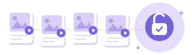
ALL CREATOR CONTENT · UNLOCKED ON SUBSCRIPTION
01
Fix the Cause, Not the Symptom
The easier fix would have been to label the window more clearly. Removing it entirely meant admitting the mechanism itself was the problem — the harder call, but the one that matched what users already believed they were getting.
02
Design Decisions Aren’t Always Design-Only
Removing the window changed the subscription’s underlying scope, not just its UI, so it needed product sign-off rather than shipping as a UI fix — working across that boundary was as much a part of this as the interface work.
03
An Honest Stopping Point
Validation stayed informal, and the project shut down a few months after shipping — before I could run a more rigorous test, or explore the next step I’d flagged: giving creators clearer, more transparent ways to tier value than a hidden day count.