
01 · SMARTMI AIR CONDITIONER
Smartmi Air Conditioner
Product Story · Visual System
Smartmi is a premium smart-home brand within the Xiaomi ecosystem. For the launch of a new air conditioner, design entered before the product was fully defined — helping shape not only how it would be presented, but how its value would be understood.
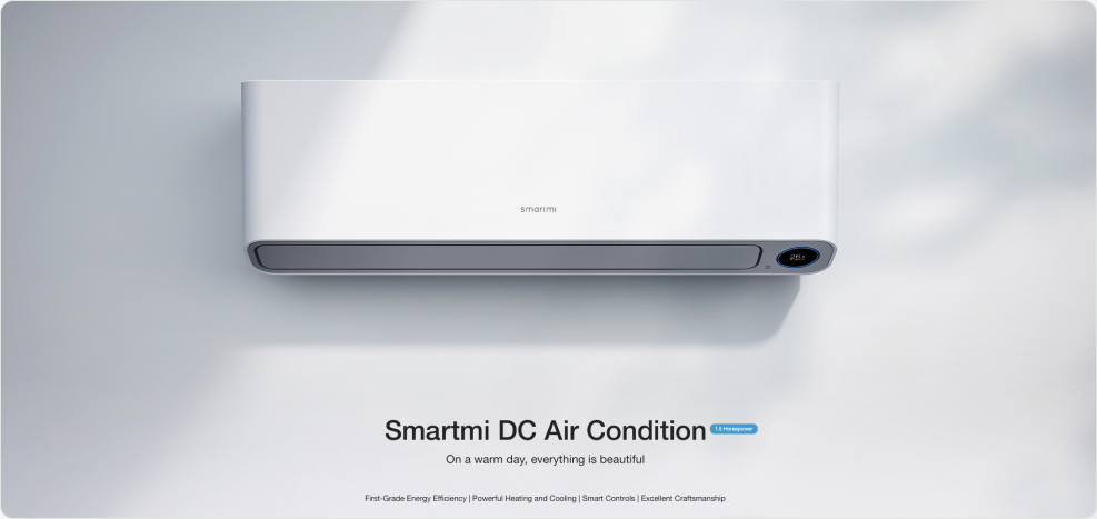

EARLY INVOLVEMENT
Design joined before launch.
I entered the project while only engineering prototypes existed. This created an opportunity for design to contribute not only to presentation, but also to the definition of the product's core value.
CORE CHALLENGES

01
Translating complex technology
Transforming engineering-heavy features into a visual language that felt simple, premium, and understandable.

02
Communicating quiet reliability
Expressing comfort, stability, and trust through visual storytelling rather than the technical specifications alone.

03
Building distinction within Xiaomi
Creating a recognizable Smartmi identity while remaining consistent with the broader Xiaomi ecosystem.
360° OWNERSHIP
From internal testing to launch materials.
01
Early product testing
Understanding real user experience before launch.
02
Positioning & value definition
Working with product and marketing teams.
03
Visual concept development
Website and product-story direction.
04
Photography direction
Location, styling, and production support.
05
Website & launch materials
Product pages and launch assets.
06
Packaging & post-launch support
Manuals, collateral, and extended campaigns.
02 · INSIGHT-DRIVEN STRATEGY
Insight-Driven Strategy
The core of this project was not starting from "how to make it look good", but from real user insight discovered in product-in-use contexts — guiding our visual strategy.
 ① USER INSIGHT (FROM IN-HOME)
Experience, not specs.
"I barely hear it running"
→ the feeling of quiet reliability
"The air feels warm and soft"
→ a sense of high-quality materials
"It blends in at home"
→ natural integration into the space
"I want a premium space"
→ a current lifestyle trend
 ② VALUE EXTRACTION
Weaken specs, amplify feeling.
Specs are not noticed
→ weaken or hide
Noise
→ "Quiet" as an emotional cue
Material
→ "Premium" as a visual touchpoint
Presence
→ "Calm" as the spatial structure
 ③ STRATEGY TRANSFORMATION
Translate feeling into visual language.
Quiet
→ abundant white space, restrained rhythm
Premium
→ low saturation, refined color & light
Reliability
→ stable grid, clear hierarchy
Luxury
→ minimal backgrounds, deliberate details
EVIDENCE
From in-home insight → product understanding → app experience
This transformation is not just about packaging or marketing. It is an extension of the insights I discovered through years of in-home product observation: recording real user reactions on-site, then translating those "feels" into visual strategies that can be consistently executed.
Smartmi Air Conditioner
26.5°
Ambient 28.5°C
Cool
Cool
Logic
Timer
"
CORE JUDGMENT
In users' minds, it's not about "how much cooling power", but "how quiet, how premium, and how comfortable it feels at home".
My role is to translate that feeling into a visual language people can instantly understand.
03 · VISUAL SYSTEM
Visual System
Premium simplicity is not about excessive decoration. It's about letting the product speak for itself.
VISUAL DIRECTION
Direction & Language
Color: low-saturation neutrals + soft accents · calm and layered
Typography: clean, stable, generous spacing · quiet confidence
Layout: breathable grids, ample white space · effortless clarity
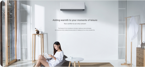
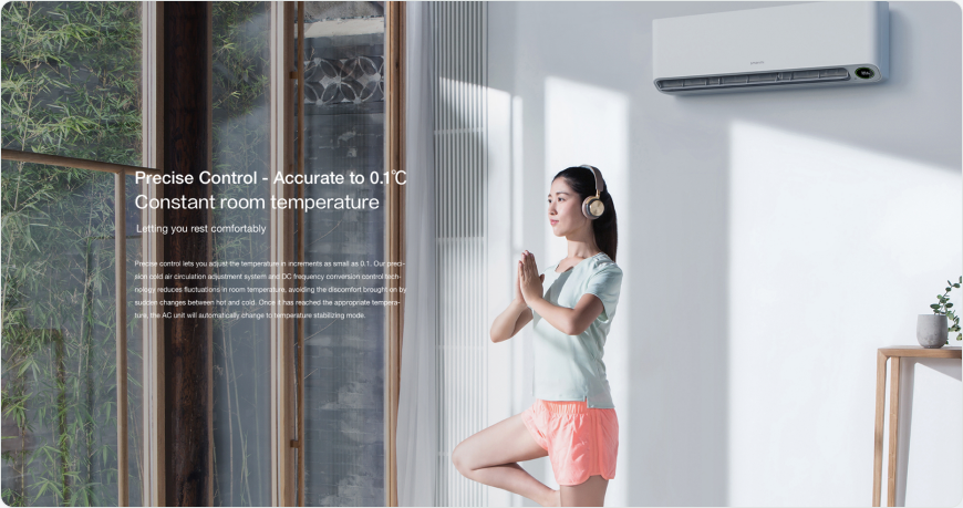
Imagery: natural light, soft shadows, refined composition
Goal: make "quiet, premium" a feeling users can instantly perceive
#F9F9F9
Quiet page surfaces
#F1F1F1
Detail backgrounds
#000000
Engineering & contrast
#54B6B7
Air & comfort
#8B6349
Heating & home
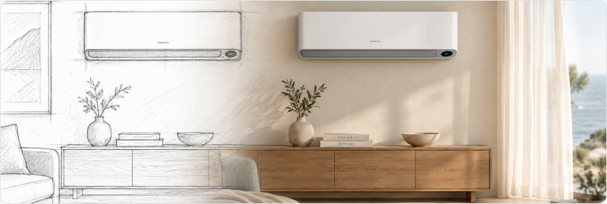
PHOTOGRAPHY DIRECTION
From Concept to Frame
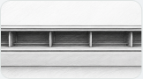
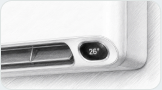
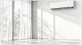
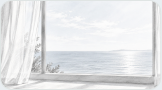
I work closely with photographers to translate design intent into imagery.
 Scenery: minimalist interiors in natural light
 Product modeling: part of everyday life
 Props: technical materials expressed through cool, refined objects
 Composition: negative space that conveys "quiet"

"
SYSTEM MEANING
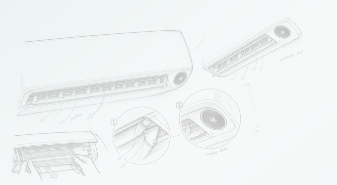
A visual system is not just "colors + fonts". It is a consistent atmosphere that connects product, page, and photography — an extension of the product's core value: quiet, premium.
04 · EXECUTION & SYSTEM
Execution & System
One visual language, experienced at every touchpoint — from product form to detail pages, manuals and packaging.
PRODUCT FORM
Communicating an engineering choice as an aesthetic
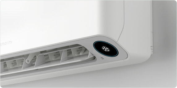
The indoor unit's suspended wall mount is a real engineering decision. The visual challenge was making that mechanism read as intentional design rather than a compromise — through photography and layout that foreground its cubic geometry and resilient ABS semi-gloss panel.
Cubic, Suspended Design
The Beauty of Spatial Integration
The indoor component adopts a suspended design style. Place the component on your wall, enjoy the aesthetics of its resilient ABS semi-gloss paneling and elegant detailing.
— verbatim, Smartmi official product copy
PRODUCT DETAIL PAGE
Information hierarchy & reading rhythm
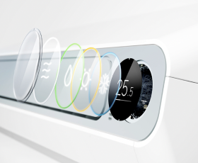
Wide layouts create a cinematic feel. No text exceeds 3 lines per block. Key parameters are placed clearly with plenty of whitespace. The page is designed for "experience", not for "reading".
 Air Conditioning Mode
 Heating Mode
 De-humidifier Mode
 Air Circulating Mode
SYSTEMATIC OUTPUT
Consistent across all touchpoints
The visual language extends to every touchpoint: online campaigns, product manuals, unified tone of voice (web → print → packaging). Everything works together to deliver the same calm, premium experience.
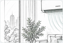
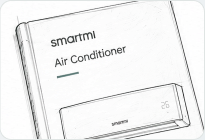
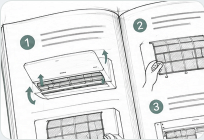
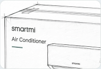
Lifestyle scene
Air Conditioner User Manual cover
Care & Maintenance booklet
Retail packaging box
"
REFLECTION
What made this project unique was that it began before the product was finalised. Joining early allowed me to understand what truly matters to users, and translate that into a calm, premium, and honest visual language. The final deliverable is not just a product page, but a brand experience rooted in real user insight.