
 724 VPN

724
VPN
PRODUCT DESIGN · MOBILE APP
FAST
/
STABLE
/
PRIVATE
/
AD-FREE


Connected
Learn More

View Showcase

A Minimalist VPN for Non-Technical Users in Mainland China
A secure, one tap VPN built for seamless two way connectivity,
— always available, always connected, and completely ad-free.


ROLE
End-to-end: User Research · UI Design

PLATFORM
iOS · Android

TYPE
Mobile App


Context & Problem
FAST
/
STABLE
/
PRIVATE
/
AD-FREE
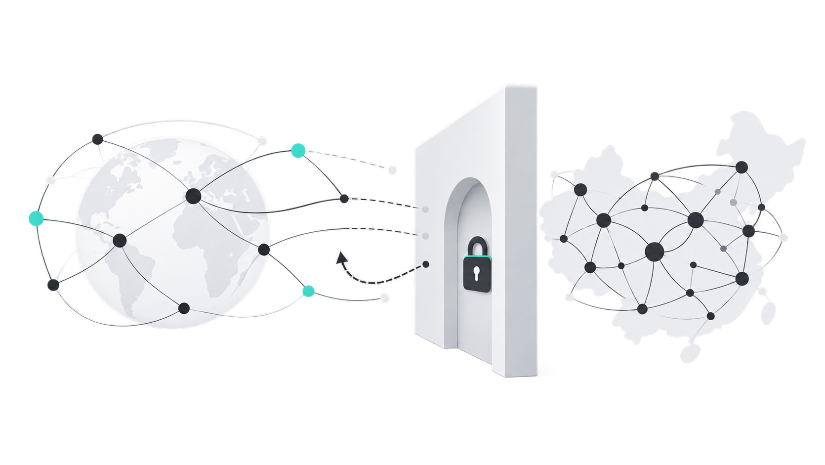
724 VPN started as an internal discussion within the team about the pain points of internet restrictions in China: difficulty accessing the global internet from China, and difficulty reconnecting to Chinese services from abroad.
Through research and analysis, I synthesized the current solutions into three key failure modes.

Failure Mode 01
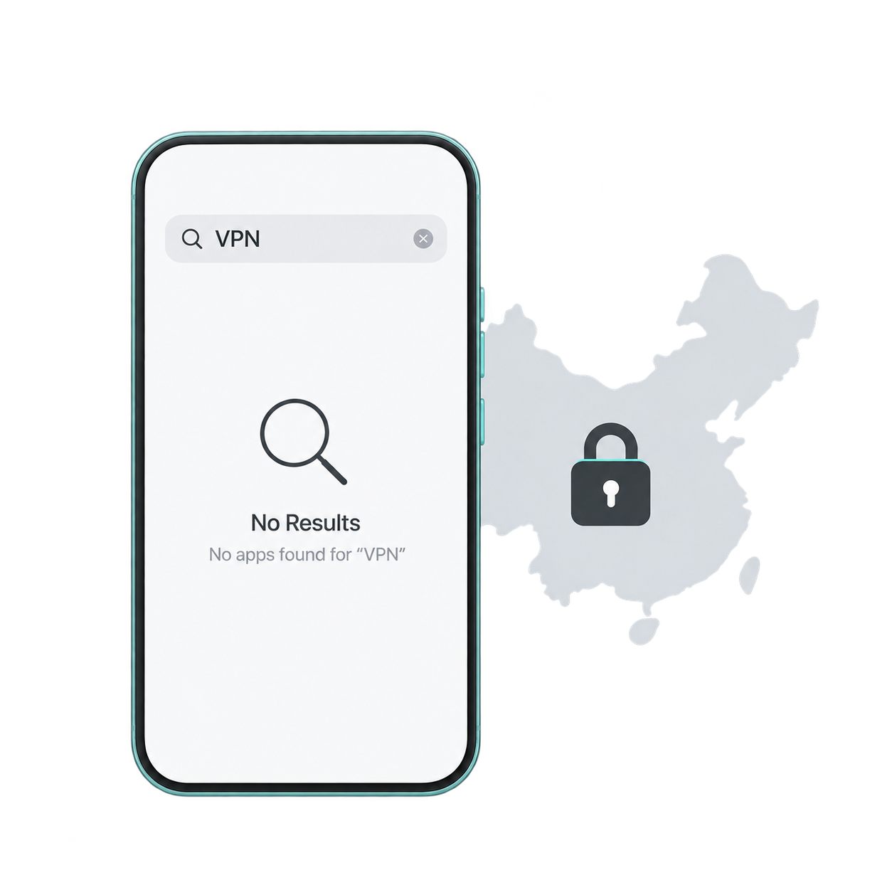
Non compliant
VPNs CANNOT be listed on official App stores in China, leaving users unable to obtain “legitimate” channels.
Failure Mode 02
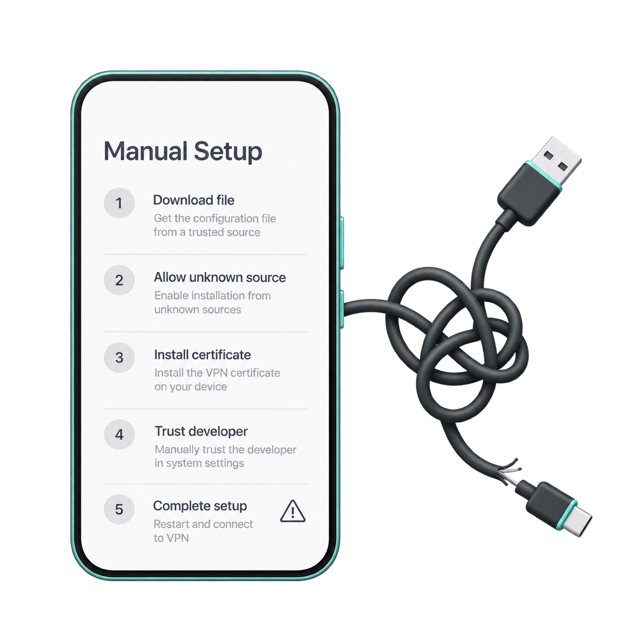
Difficult & Unreliable
Complex installation for non-store channels. Many users dare not use them and therefore never try.

Failure Mode 03
Ads Imitate Users
Ads on and networks and mini ads imitate VPNs. Users may click by mistake and even enter malicious links



FAST
/
STABLE
/
PRIVATE
/
AD-FREE

Most are “one way”,
few are “two way”
Through my research, I found that most VPNs on the Chinese market are one-way , just helping users go abroad, but rarely offering a way back home. Few provide a seamless 'go out and come back' experience. This is the opportunity for me to differentiate: build a true two-way VPN.

TAKEAWAY
Astrill VPN, LetsVPN, ExpressVPN, Surfshark and NordVPN, the top products in Mainland China — used as benchmarks.

Product Comparison
One-way · Two-way · Ads · Interface Simplicity

One-way
(Go Abroad)

Two-way
(Go Out & Back)

Ad-Free
(Zero Ads)

Simple UI
(One-tap Connect)


Astrill VPN


LetsVPN
ExpressVPN
Surfshark
NordVPN
724 VPN



My Role
FAST
/
STABLE
/
PRIVATE
/
AD-FREE
I was fully involved in this project, from early user research and isight discovery, to defining design principles, and finally delivering the UI design.

MY END TO END WORKFLOW




01


User Research
Competitor / Feedback Analysis
02


Insight Discovery
03

Define Design Principles
04

UI Design
05

Handoff & Iteration
Team Collaboration / Workflow
TEAM COLLABORATION



Marketing
Customer
Support
Front End
END-TO-END OWNERSHIP
What I Own & Who I Work With
I led the entire process from user research to complete UI design, ensuring our decisions were guided by data and user feedback.
During development and launch, I worked closely with the team to ensure design integrity and a seamless user experience.


User Research
Understand Users

Development
Build & Implement

Customer Support
Listen & Improve
×
×

Insights & Principles
FAST
/
STABLE
/
PRIVATE
/
AD-FREE
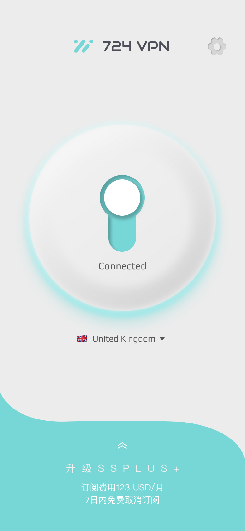
Through research, we distilled two key insights that shape the product and guide every design decision.


01
Trust is everything
Users don’t need “more features”, they need reliability, stability, and peace of mind.

02
Simplicity is not superficial
Users want “it works”, not “it looks good”. True simplicity means reducing cognitive load and making every step effortless.

CONNECTION FLOW
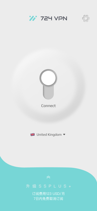
01
Launch
02
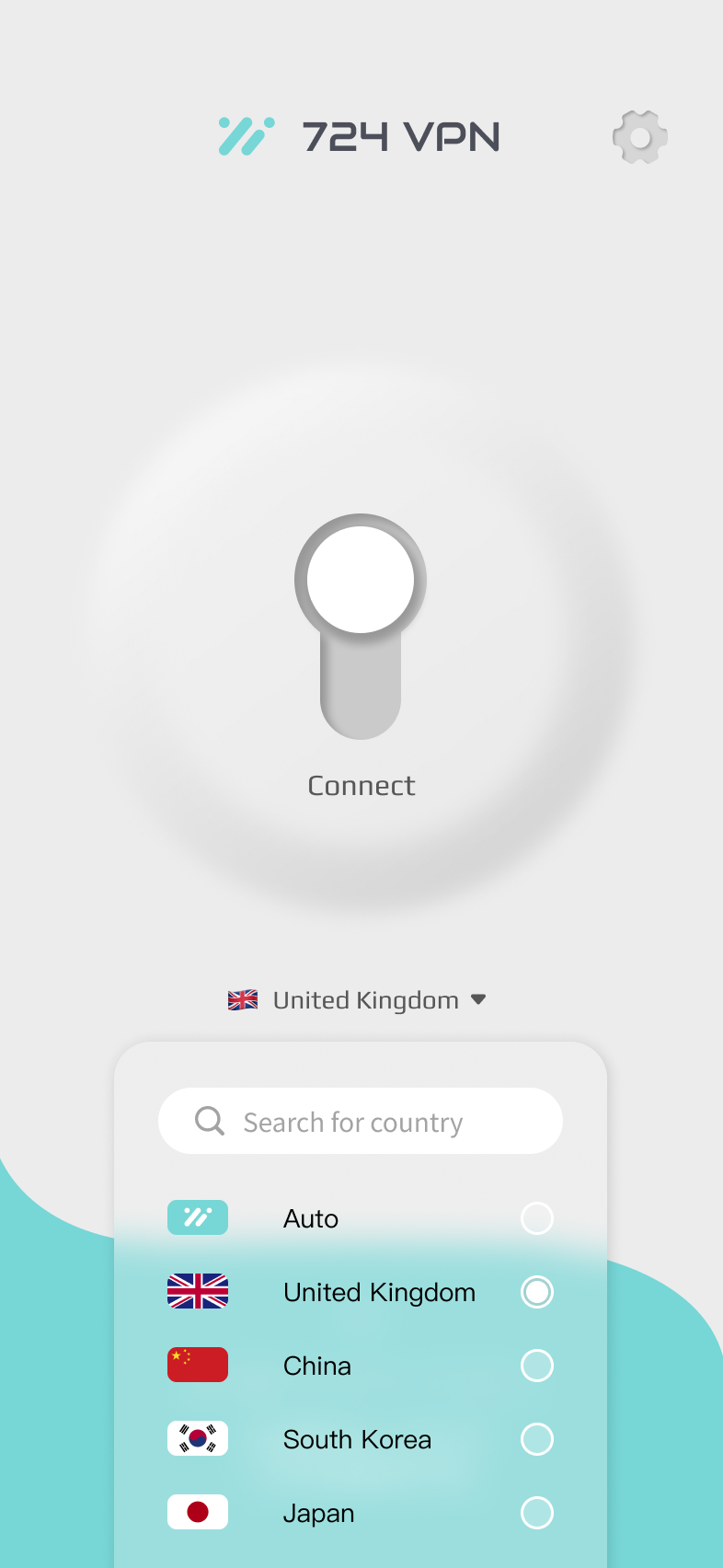
Choose Location
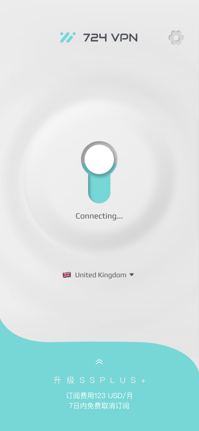
03
Connecting
04
Connected


DESIGN PRINCIPLES
One core mission.
Three clicks.
That’s it.
Open the app, tap to connect,
tap to change, tap to disconnect.
Everything else gets out of the way.


Principle 01
Own the core experience
Make connecting to VPN as simple as choosing your country.

Principle 02
Pure, clean, and trustworthy
A clean interface builds confidence. Trust is the best feature.


Server Selection
Multiple region options

Connection Management
Standard connect / disconnect

Data Security
VPN Core Features


30-Day Plan
365-Day Plan
Subscription Plans


iOS In-App Purchase
Android In-App Purchase
Payment Channels
Monthly → Annual
Annual → Monthly
Cancel Subscription
Plan Changes


Subscription & Payment


Standard Guest Sign-up
VIP Guest Sign-up
Registration


Guest
Registered Member
VIP Guest
Can purchase directly as guest

VIP Member
User Identity


Registration & Identity


Language Settings
Simplified Chinese / Traditional Chinese / English

Redemption System
Provides channel marketing codes

Delete Account
Compliant with iOS guidelines

User Support
User Contact Center

Collects user feedback

Cookie Policy
Terms of Use
Privacy Policy
User Agreements


Other Settings


VPN




FAST
/
STABLE
/
PRIVATE
/
AD-FREE
I first used a user flow diagram to clarify the product logic, and then broke down each key decision — clearly presenting the problem, options, choices, and reasoning.

OVERVIEW
User Flow + IA Overview (Product Logic Framework)
Key Design
Decisions

Launch
Choose Location
Connect
Connected
Setting








FAST
/
STABLE
/
PRIVATE
/
AD-FREE

DECISION 01
One-tap Connect +
Status Visualization
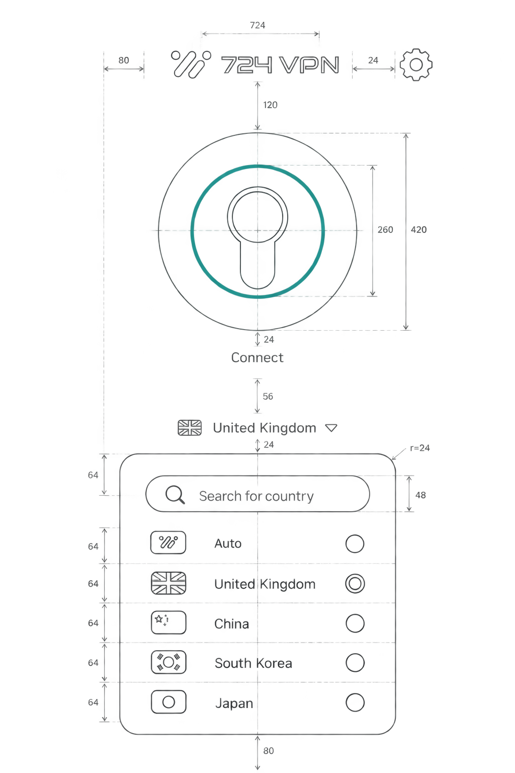
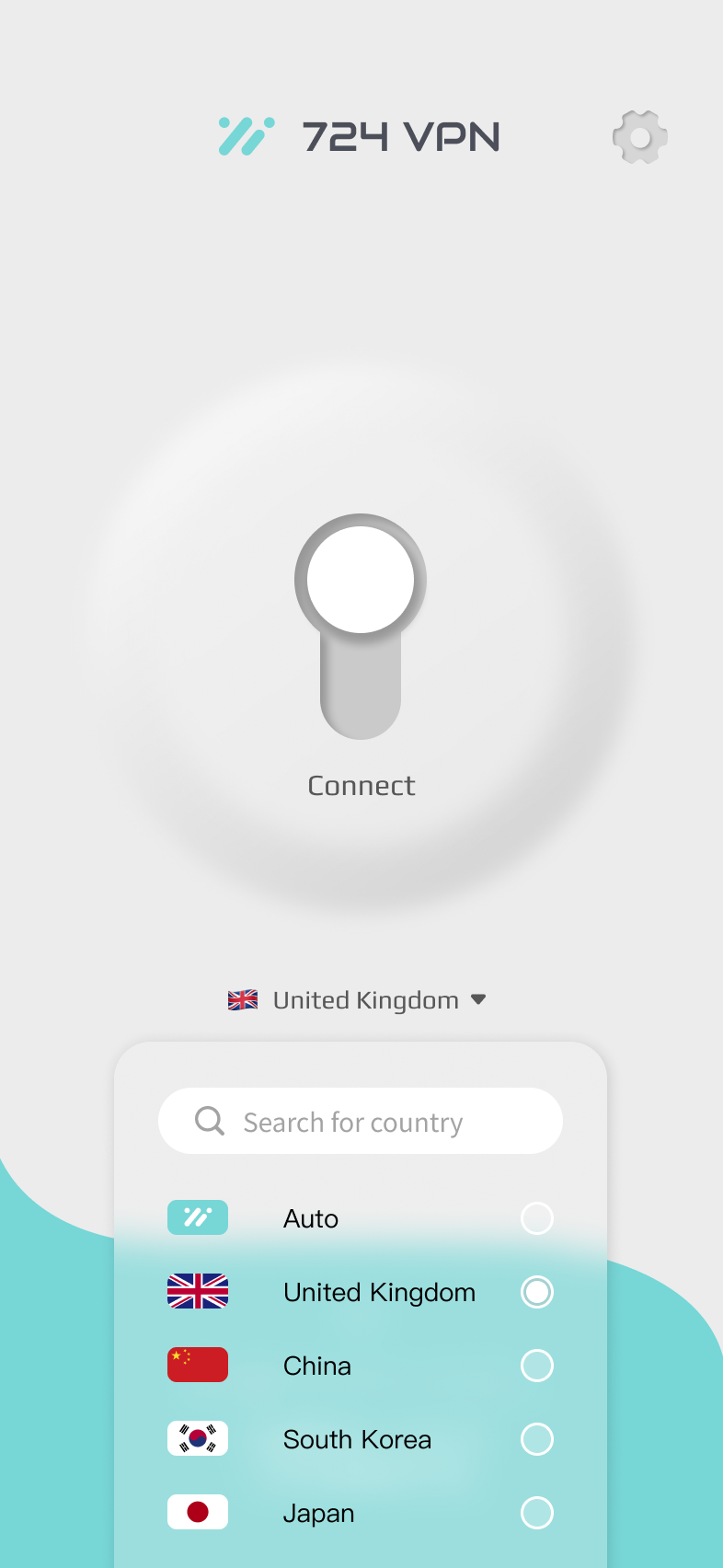
Connecting is the core action of a VPN. I designed a large central button and clear status transitions to make the connection process intuitive, trustworthy, and reassuring.
DECISION 02
Two-way Mode with Country List,
No New Plugin
"Go abroad, return home" is a real and common need. I used a country list to achieve two-way switching without adding new plugins. Users can simply select a country or "Auto" to access both networks.
DECISION 03
Clean Experience, No Ads
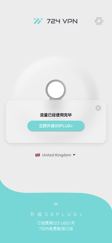
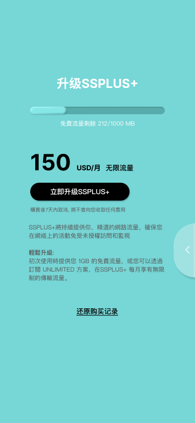
Ads break the experience of a tool product. 724 VPN is ad-free. Even if users hit the free limit, the upgrade prompt is shown once politely, never intrusive.
Search for country

Auto


China


South Korea

Japan

United Kingdom





FAST
/
STABLE
/
PRIVATE
/
AD-FREE

After completing the design, I conducted internal testing first, then shared the connection link through various channels to recruit external testers, focusing on validating whether the core flow works end-to-end.


TEST 01
Internal Testing
Team members tried it first, validating key steps such as connecting, selecting nodes, and subscription payments to ensure the basic usability of the core flow.

Connect

Select Node

Subscribe


Success


TEST 02
External User Testing
Shared the connection link through various channels to recruit external testers, collecting real-world feedback beyond the team to better understand actual user needs and pain points.

100%
Successfully
Connected


96%
Easy to Use

92%
Would
Recommend


Design Principle Validation
Due to limited team resources, this round of testing focused on validating the "core flow usability". We did not conduct large-scale or structural usability tests. This is also a point for further improvement and discussion.
Validation

FAST
/
STABLE
/
PRIVATE
/
AD-FREE

After launch, user feedback validated our core positioning and also revealed areas that needed improvement.


POSITIVE FEEDBACK · POSITIONING VALIDATED
Users Truly Feel the Value

Easy to use and get started quickly
24/7 customer support, fast and helpful
Fast card payment and secure transactions

NEGATIVE FEEDBACK · ISSUES REVEALED
Two Main Areas of Concern

Unstable Connection
Caused by server-side backend implementation
“Merchant” Misunderstanding
Some users thought their subscription was being sold to third parties

ITERATION
Based on Feedback:
Improve Subscription Transparency
To address the “merchant” misunderstanding, I enhanced the transparency of the subscription flow in the next version — clearly stating “cancel anytime” and “charged monthly” to reduce user hesitation.
Before Iteration
After Iteration
Choose a Plan


Monthly Plan
$9.99
/ month
Billed monthly
Continue
Choose a Plan
Monthly Plan
$9.99
/ month

Cancel anytime
Charged monthly
Continue

Outcome

FAST
/
STABLE
/
PRIVATE
/
AD-FREE

Reflection
This project showed me that design comes with responsibility even when conditions aren’t perfect.


FINAL TAKEAWAY
Design must account for the uncontrollable — that’s the most important lesson I’ve learned from this project.


THE PROBLEM
Connecting — Failed
No clear feedback when the connection timed out — users were left waiting with no signal that something went wrong.

THE GAP
Design Can’t Solve Backend Instability
The instability came from backend infrastructure. My UI could clearly communicate the problem — but it couldn’t solve it.

THE FIX
Clear States + Retry Control
Make failure states unmistakable, then add manual retry and automatic node switching — giving users a way to act instead of just wait.


FAST
/
STABLE
/
PRIVATE
/
AD-FREE

Showcase
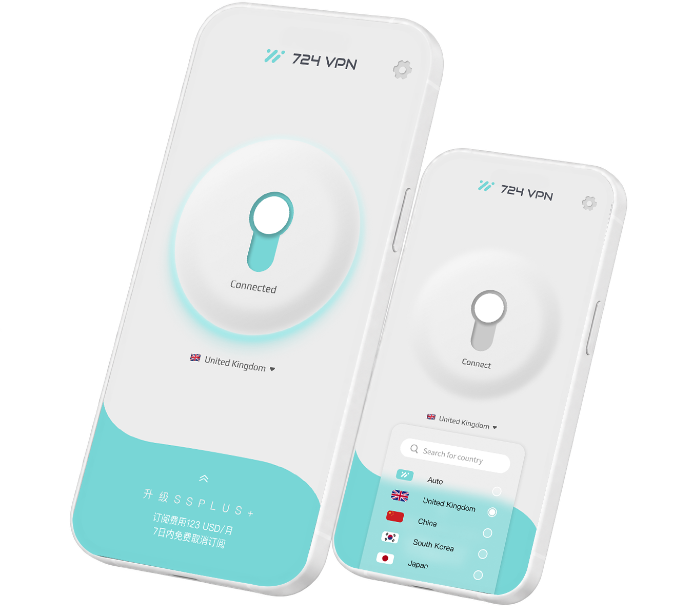
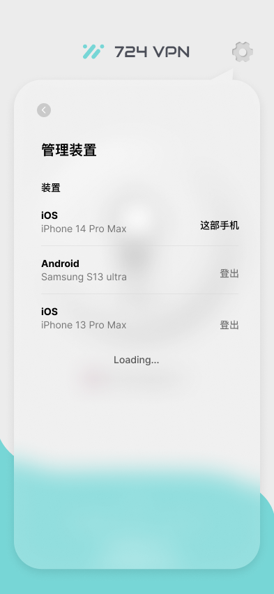
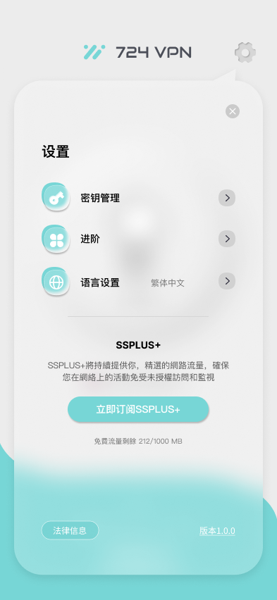
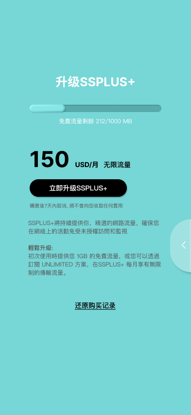
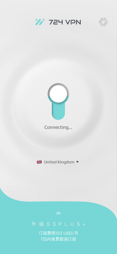
From principle to pixel, the final interface,
shaped by everything explored throughout this case study.


Button
#77D6D6
RGB 119 214 214
#ECECEC
RGB 236 236 236
#CACACA
RGB 202 202 202
#575757
RGB 87 87 87
#A3A3A3
RGB 163 163 163